the research...
My intent for this project is to use photography with the topic of colour blindness as it is a good way for me to portray the view of people who are colour blind through photography that will be showcased in a photography competition and the photography magazine for the Independent Project. This not only helps me learn and improve but also help in raising awareness on colour blindness and how they see the world. I intend on making the connection between photography and colour blindness to further show the importance of colours and how it will be like for people with colour blindness
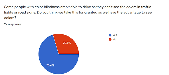
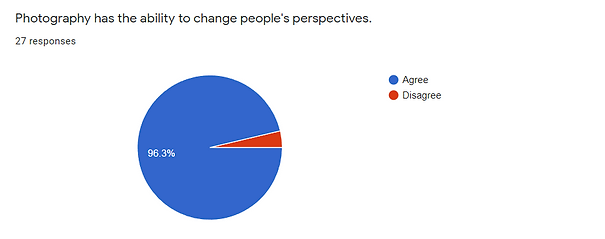
survey
66.7% also agrees that coloured photography can impact creativity among society as black and white photos could affect emotions through the audience as colours play an important role to evoke emotions further in photography and design.

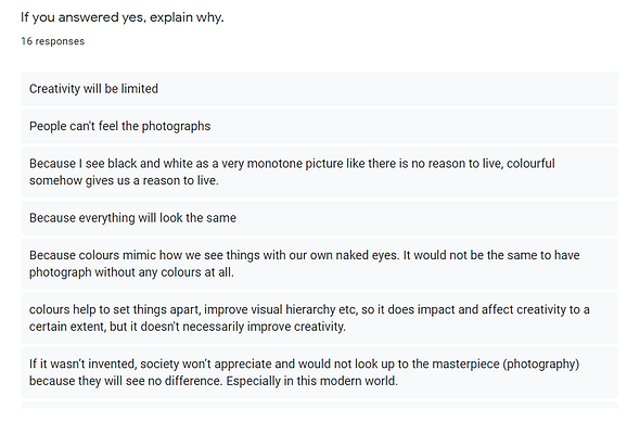
Creativity can be limited in a way that the audience has to make something distinct in photography or film is through the shapes of the character. While there is no problem in that, colours still can change a lot in how photographers or even filmmakers set the mood and tone in their stories.
As we can’t feel photographs or films, colours help us imagine how it would be like to be in their stories that they want to share with their audiences such as a cool tone colour in photography or film can portray sad or melancholy emotions while warm tones can portray the feeling of happiness or optimistic (Totus, The importance of colour. A brief look into the colour psychology. 2020).
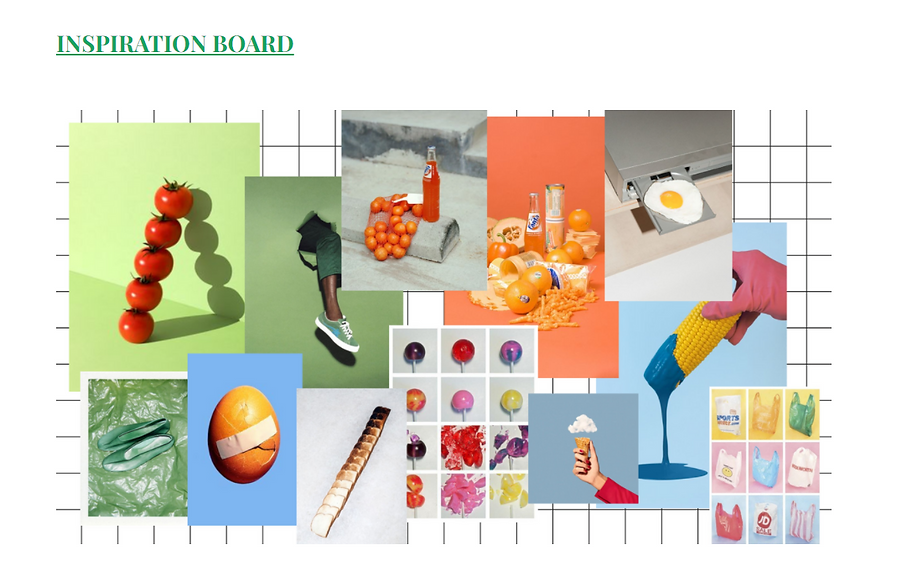
visuals & still-life inspirations
Still-life photography is more than just focusing on objects but we can use it as a way to help increase our creativity in finding a way to use simple or common objects in our own creative ways to make as a main point of the subject in photography. It gives us a sense of control in our photographs and we are able to show our skills and artistic style in photography (Still life photography: The complete guide n.d.).
There are many ways that this style can enhance and change the way we look at photography the same way colours do in photographs and film. It gives us a lot of room to be creative in how we use common objects and colours to share the stories that we want to capture.
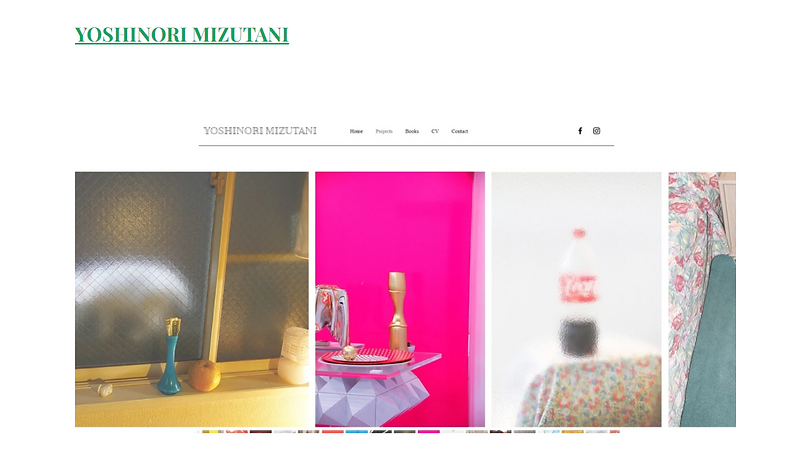
Still-life is not just about using objects that we can tamper with but it could also be objects in our environment such as the colour of a building or signboards on the road. One of the photographers that I have looked into, Yoshinori Mizutani who made a project on colours and using still-life photography to capture different colours in common objects in his environment (Mizutani, Yoshinori Mizutani: 水谷吉法: Colors 2018)
Still-life photography could also be more than just showing our artistic style but it is also very commonly used as a way to advertise products for designers and photographers who work in the advertisement industry.
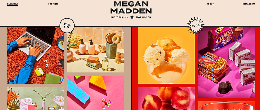
Another photographer that I researched is Megan Madden who use still-life as a way to advertise products of different companies that she has worked with. Megan Madden also uses simple objects such as foods to use as the main subjects in her photographs. Moreover, she also proves that this photography style can be turned into a stop motion style to enhance the subject and make advertising more interesting (Madden, Megan Madden n.d.).
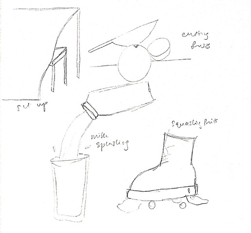
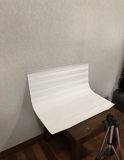
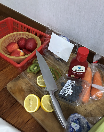
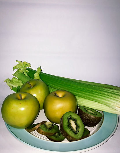
photoshoot
progress
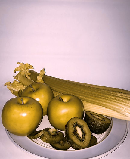
The design in my external project mainly focused on photography style, still-life, and colours. The photograph’s subjects are mainly focusing on environmental and common objects that consist of different colours around us. These photographs will be working alongside my independent project which is a photography magazine about colour and colour blindness among society.
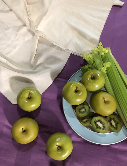
The mood of the photographs used for this project is vibrant and colourful as the objects in these photos are full of different shades and tones. Some of the subjects in these photographs consist of foods, environmental objects such as public signs and common objects such as colourful mugs, paints and arts.
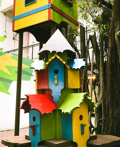
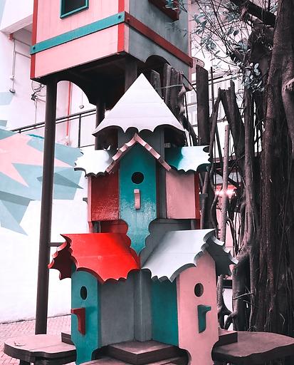
The photos that will be used in the magazine will be transformed into a colour blind point of view as it will help in conveying the message in the magazine to raise awareness on colour blindness through photography. As people with this condition struggle with seeing the shades and tones in a photograph, I want to use this transformation of point of view to be able to show how the colours might impact the way they see pictures differently than we do.
-min.png)
deuteranopia
%20(2).png)
tritanopia
Still-life style photography will be working with different contrast of colours or even monochromatic colours in the subjects to share the importance of colours in photographs and the creativity we put into still-life photography to make it interesting and turn it into our own style of capturing objects. Still-life objects and colours are the focal points of the photography competition.
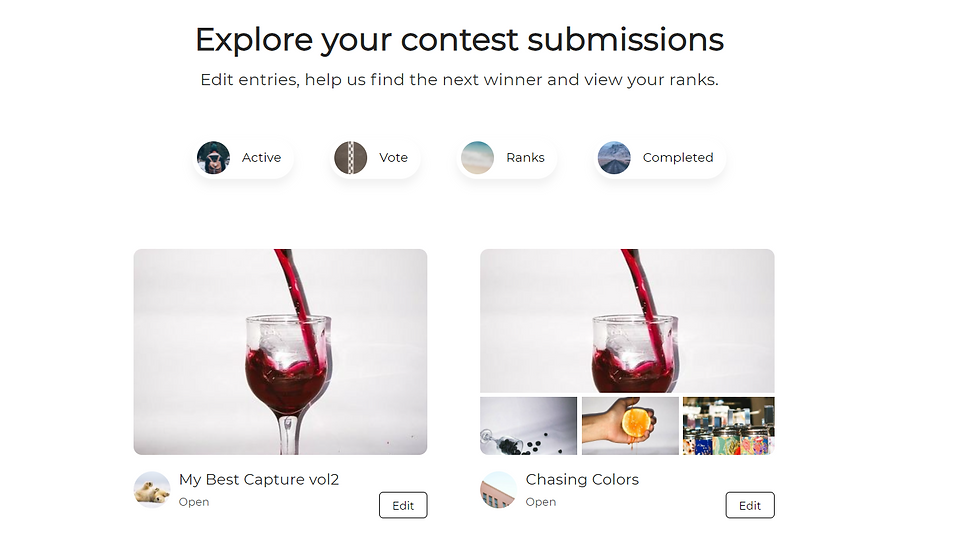
submission