GETTING
THERE...
My first idea for this project is to focus on colours and how it affects us personally. Upon researching about colours, I came across the topic of colour blindness and how they see the world. Many of us forget that there are people in our world who can’t see colours the way we do, hence why I have chosen colour blindness to be the main topic of my independent project.

mind mapping
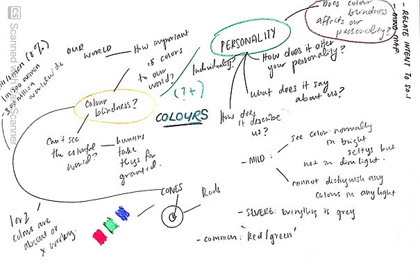


There will always be a part where we will never understand what it truly feels like to be colour blind however, we can always find ways to support and help others who are going through it whether it’s family members, friends or colleagues. The magazine is a way to shine a light on this topic so the audience can understand and know a little bit more about colour blindness, how it affects them and how they see the colourful surroundings.
surveys & interview

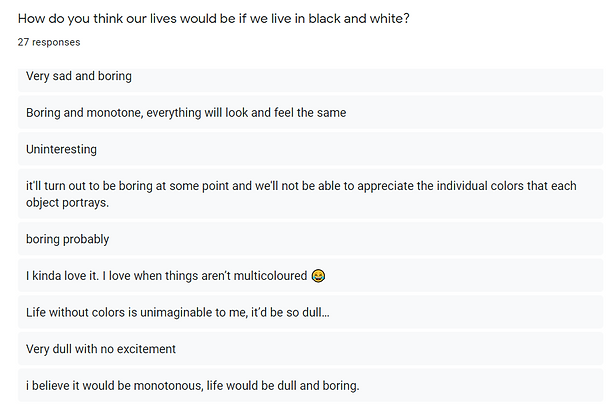
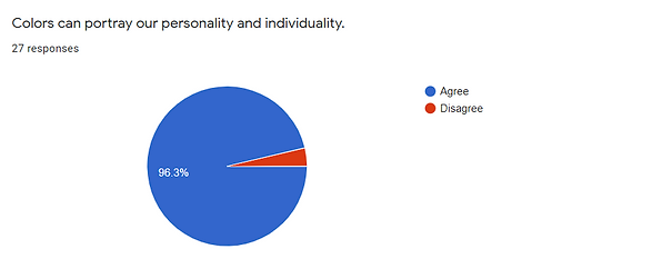
Through this survey, the majority of 70.4% agreed on the fact that society took colours around us for granted as we always knew how colourful our world is on the contrary with those who was born colour blind. However, people who were diagnosed as they get older knew how much of a difference the world is before they were diagnosed and how it can be hard to go through everyday life without colours to guide them to do simple tasks such as driving or cooking.



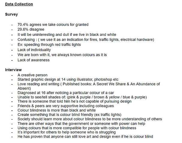
Moving on, an interview was done with Hussain Ali who is a writer and a graphic designer since he was 14 was diagnosed at 16 years old as he is unable to tell the difference of the shades pink, purple, blue, and brown.
From my research, there are some who aren’t able to continue their careers such as graphic design, fine art or photography (ColourBlindnessAwareness, n.d.). However, despite Hussain proving to be colour blind and being told that he could not pursue his dream to be a graphic designer, he managed to overcome the struggles and continue to excel in graphic design. brown.
case study

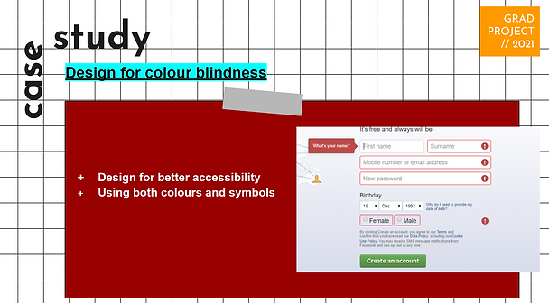

we can still find ways to help people with colour blindness to overcome their obstacles such as using patterns and textures or avoiding certain colour combinations such as green and red or blue and purple to make the design more colour blind friendly (Hussain, Case study how to design for colour blindness 2018).
In addition to that, we could also use symbols or display the names of the colours portrayed (Desai, The UX of among us: The importance of colourblind-friendly design 2020). Other than raising awareness there are always ways that we can try and help others who are in need of our help so we can all appreciate our beautiful and colourful surroundings.

design &
visuals
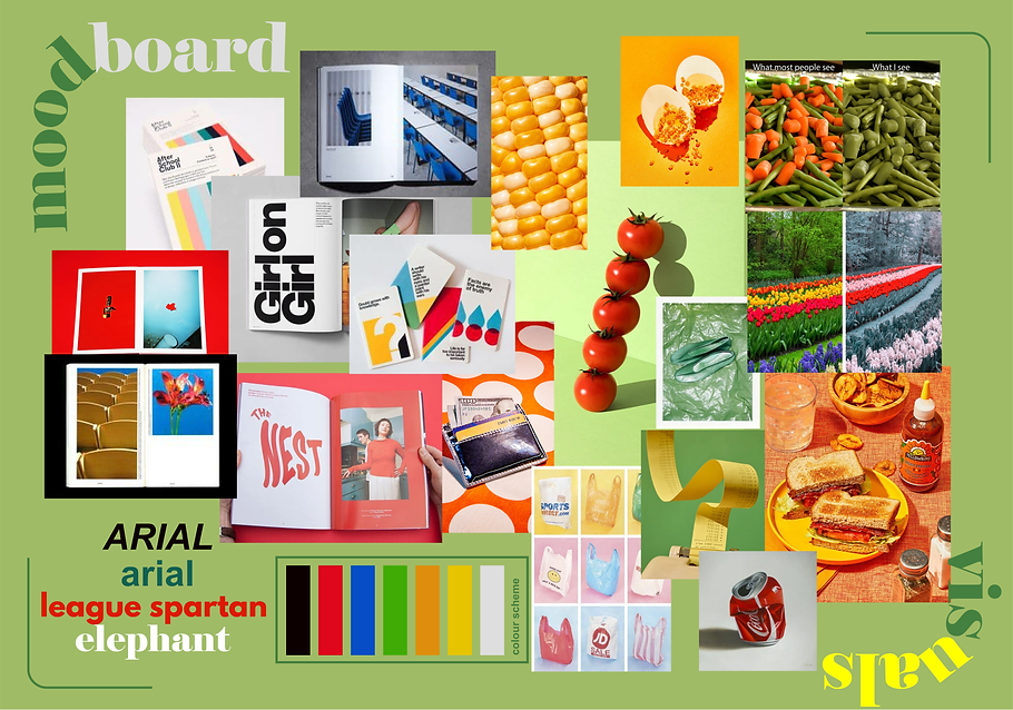
To fit with the modern and simplicity of the magazine, modern styled fonts such as Arial and League Spartan will be used and Serif fonts will be included to add some balance to the design. The placements of fonts and photographs are an important part of the designs to make the magazine stands out and be interesting.
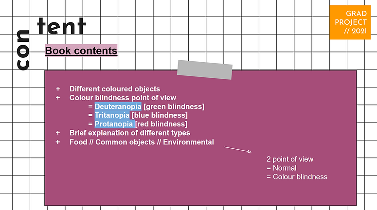
In this magazine, I focus on 3 common types of colour blindness are Deuteranopia, Tritanopia, and Protanopia. This, also shows that colour blindness is more complex than we think and different individuals have different types of blindness. The comparison of photographs in the magazine will help us see how different their point of view is and the different colours they aren’t able to see.
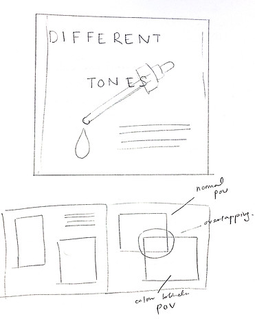
The magazine will consist of a simple coloured or white background to enhance the minimalism style of this magazine. It also helps give attention to the photos inside the magazine as the contrast between the photographs and background is higher.


