
photo-magazine


Colour blindness
As we are born into this world, it takes us 4 months to develop colours in our eyes and to be able to see the beautiful shades of colours around us. Imagine the world without colours and splashed with black and white tone, would our world be different then? Fortunately, for many people, we are able to appreciate the beautiful shades of our surroundings from plants, flowers, the colour of our clothing, and even the colour of our cheeks when we blush. However, for some, they are unable to see what we see
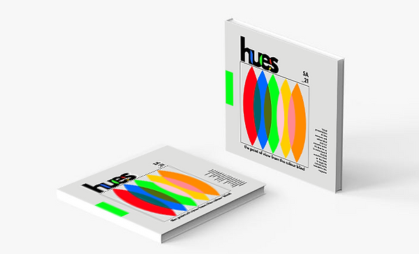
A photo magazine based on the perspective of the colour-blind. How do they see the world? How different are our perspectives from theirs?
This magazine shows their point of view of our surroundings, in common objects, foods, and more through photography.

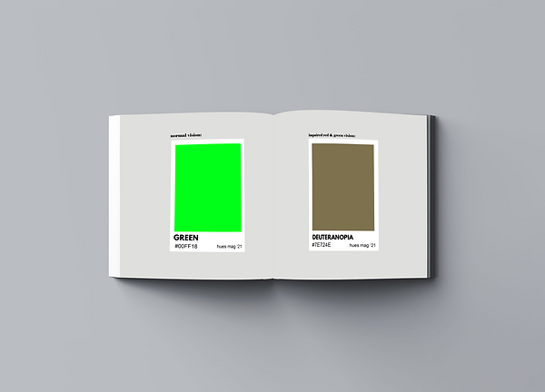
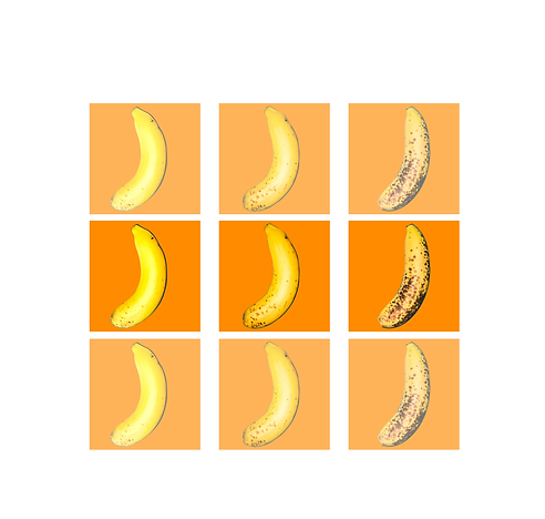
1
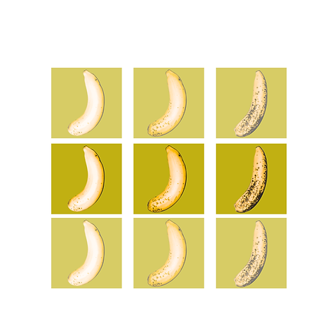
Deuteranopia or green & red blindness is a type of blindness that is known as the inability to tell the difference between red and green pigment. It is one of the dichromacy colour visions which is when someone only has 2 types of cones and completely absent one cone in their eyes. Deuteranopia is one of the most common types of colour-blindness among other types.
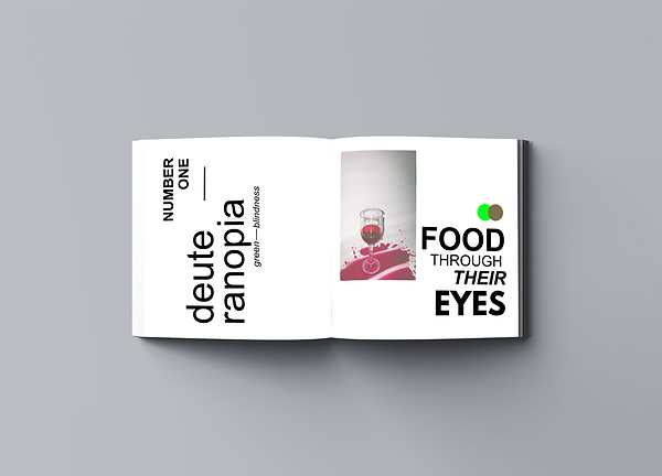
deuteranopia
.png)
.png)
.png)
.png)
.png)
.png)
.png)
.png)
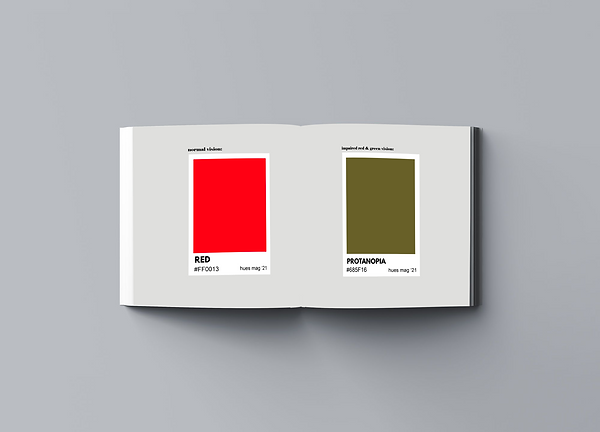
2
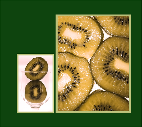
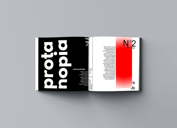
Protanopia is red & green blindness which is when someone who completely lose the L-cone in their eyes. Someone with protanopia is unable to distinguish the shades of red and green. Protanopia turns the colour red into more green shades and only absorbs blue and green tint.
protanopia
.png)
.png)
.png)
.png)
.png)
.png)
3
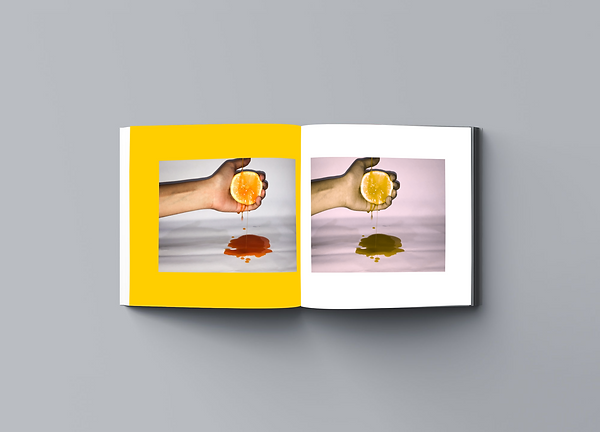
Tritanopia is when a person is unable to differentiate the shades of blue and yellow, however, they still have a normal red and green vision. It makes you confused between blue and green, purple and red, and yellow and pink.
tritanopia


.png)
.png)
.png)
.png)
.png)

Reflection
This project has taught me to understand different experiences people go through in life especially on the things that are common such as seeing colours. Being fortunate enough to see colours sometimes can make us take it for granted as there are others who can’t. I was also lucky enough to be able to talk and listen to experiences faced by someone who is colour blind. This interview has inspired me more to raise awareness on colour blindness as it is more complex than we think it is. Until we are able to see ourselves, we should not take it for granted. This magazine is to also make us wonder what our world would be like without the vibrant shades around us and how they can impact us mentally and emotionally.
Doing this project has opened my eyes to the different struggles some of us have to go through. Not only that but also I have learned new in-depth details about colour blindness and how it can impact someone. This should be more talked about as many of us go through it every day but were not understood enough by society. By raising awareness on this topic, we can come together and help them through this struggle by making things more accessible for them in the environment and even in art and design.